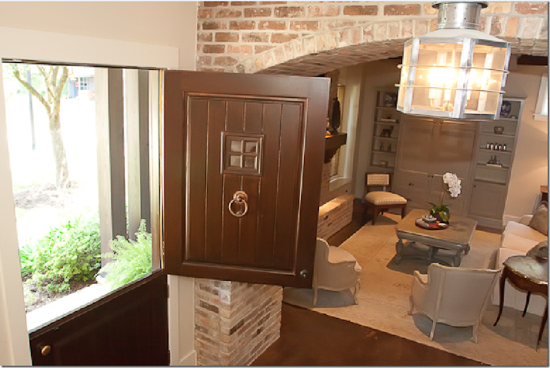
Last year, I was invited to tour a house by a mutual friend of the owners who thought I would like to show it on the blog. I was all ready to go with the story back then, but there were still a few things that had been ordered by the interior designers that had yet to be installed. So, we decided to wait for these last few finishing touches and now, it’s all ready for its debut. Most houses in this inner loop neighborhood are very nice, but this house stands out even among all the others. The appeal is in its differences – it has been custom built – and it’s uniqueness is evident right at the front door, a charming wooden Dutch door with its own peep window and brass knocker.
Looking down from the staircase, the front door is a wonderful Dutch that opens at the top – a real plus on Halloween! Here you can see the brick arches that run down the entry hall, separating it from the living/dining room.
Once you enter the house, the interior details that make it unique became evident immediately: the floor is a stained concrete, the ceiling is beamed, and a series of brick arches run down the long entrance hall. The wet bar sits behind its own brick arch. The current owners bought the house from the couple who had it built and who have now built another house nearby. Since moving in, the couple have spent their first few years here changing up the decor, making it their own. They enlisted the design team of Lyndon West to help with the interiors: Charlotte McFadin and Traci Thompson headed up the project. These beautiful photographs were taken by Julie Landreth who specializes in both family and design photography. Enjoy!
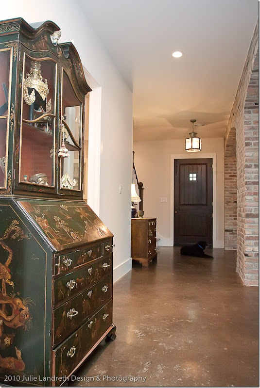
Looking down the entry hall towards the front Dutch door. The living/dining room are to the right behind a series of brick arches. The bar sits next to this chinoiserie desk behind its own brick arch. The stairs are next to the front door. Here you can see the unique flooring – a stained concrete.
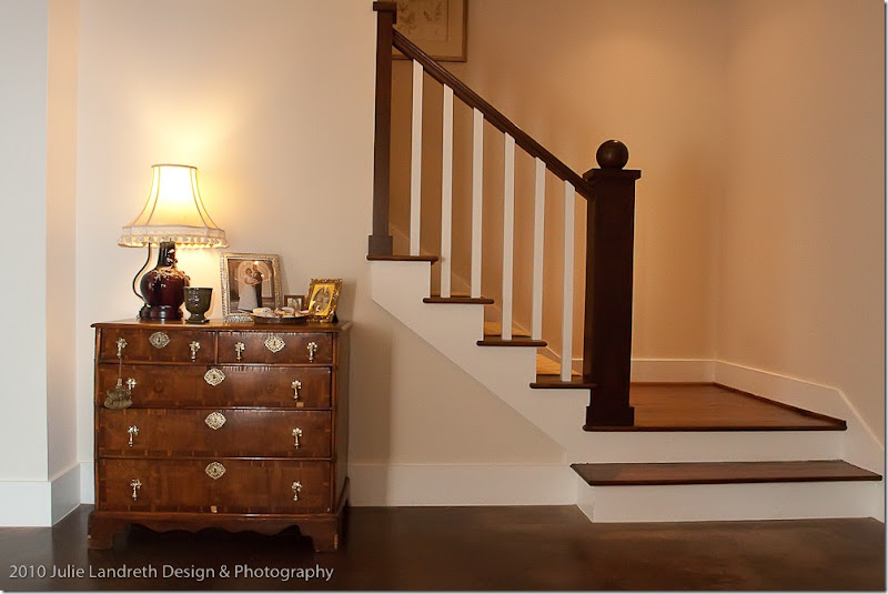
A beautiful English antique chest sits in front of the stairs. The furnishings are a mix of antique and new, some pieces are even a soft contemporary. On the stairs, a new patterned carpet runner has recently been added to the décor.
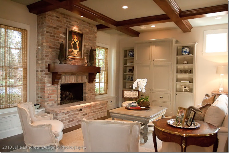
Across from the entry hall is a large living room/dining room combination. Above it is a beautiful wood beamed ceiling in a grid pattern. The furnishings are a mix of antique and new – here two French chairs sit next to a more contemporary side chair. The large bookcases are painted to blend in with the walls. The owners opted for textured blinds instead of curtains on this side of the room. Underneath is a muted, light colored area rug.
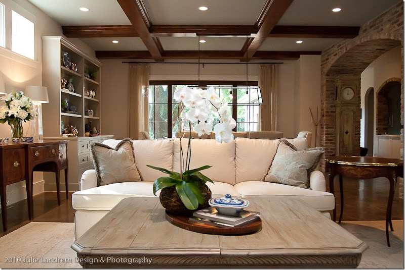
Looking from the living area towards the dining area. Here you can see on the very right – the wet bar behind the brick arch. The entry hall leads back to the family room/kitchen area.
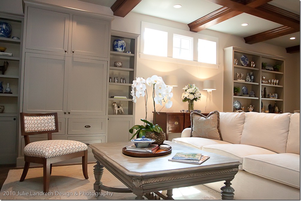
Dividing the living area and the dining area is a trio of windows up high. Each side of the room has its own built in bookcase. Here, a contemporary chair sits next to the antique styled coffee table.
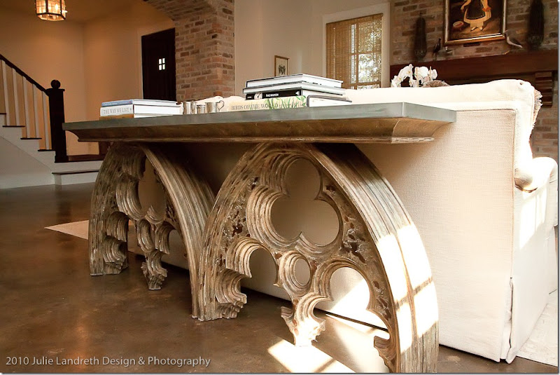
A zinc topped arched element console table sits behind the sofa which divides the living area from the dining area. The arches in the table repeat the brick arch motif found in the hallway. Aidan Gray sells a similar tin top “Arched Cathedral” console. HERE.
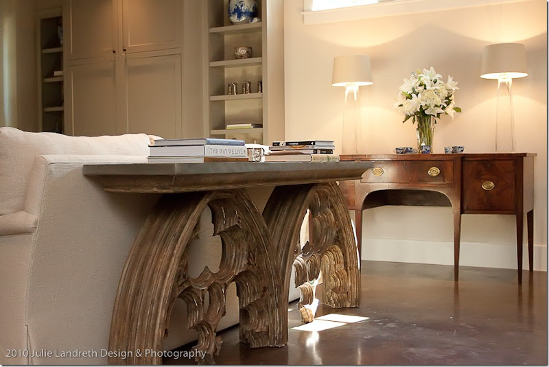
Looking towards the other direction – I love the juxtaposition of the classic English console with the more trendy console! So pretty! And I love the contemporary, simple glass lamps on the console. This space is between the living area and dining area.
The dining area has its own matching bookshelves, minus the closed cabinet doors. I like the way the shelves were designed with the heavy “foot.” The light fixture is wonderful – again a more trendy, contemporary style to mix with all the antiques. The light fixture really makes the room – I just love it. Similar ones can be found at Brown and Restoration Hardware. The wood table is antique looking, while the chairs are more transitional or classically styled – notice how the heavy chairs weigh down that side of the room – perfect!!!
In this view, you can see out the window to the back yard. Here, there are curtains to soften the dark, wood stained French doors. In this picture you can really see how perfectly proportioned the light fixture is to the table and chairs.
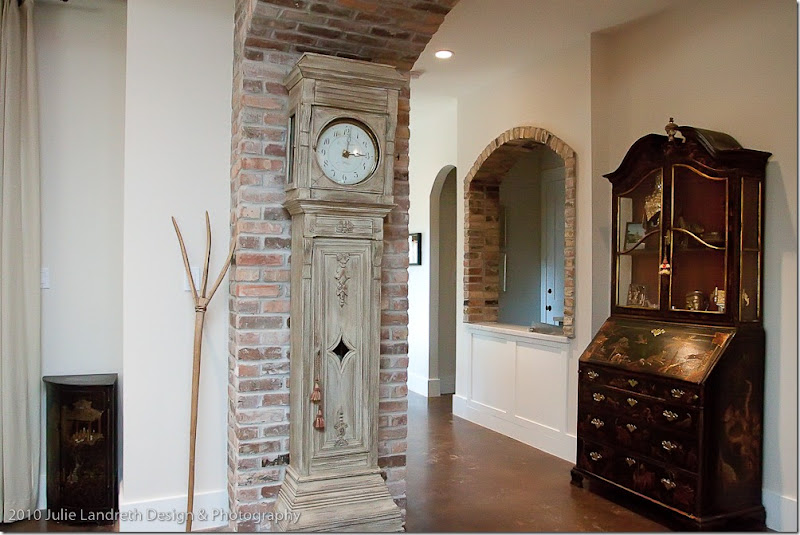
Here, an antique clock with a trendy white wash finish looks wonderful against the brick arch. I adore the pitchfork in the corner and then, following the eye, lower still, the corner Oriental cabinet. I love how the eye goes from high to low here with a mixture of the fine and the rustic. The bar is seen here through the arch – the kitchen and family room are at the end of the entrance hall.
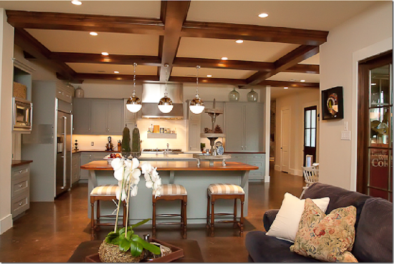
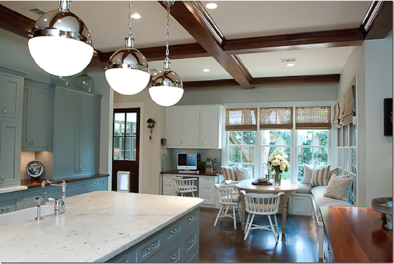
The large kitchen/breakfast/family room sits at the end of the entrance hall. Behind the sofa through the door is a screened in porch. The kitchen cabinetry is painted a soft blue gray. The grid ceiling is continued through into this area, as is the concrete flooring.
The countertops are a combination of white marble and wood.
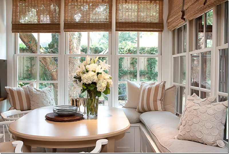
The breakfast room is in the corner – a screened in porch is on the right side behind the windows. So pretty!
Going up the stairs is a window seat and here you can see the patterned carpet that runs up the stairs and down the hallway.
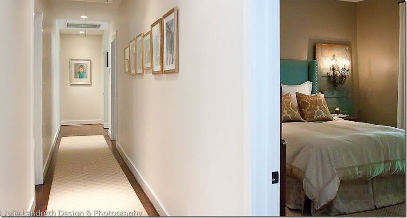
I really like flat weave patterned carpets like this – in a trellis pattern especially, or in a small dotted pattern. So much better than just plain carpet. I also really like carpet when it is two-toned as opposed to tone on tone. Just my opinion, for what it’s worth. The guest room is to the right.
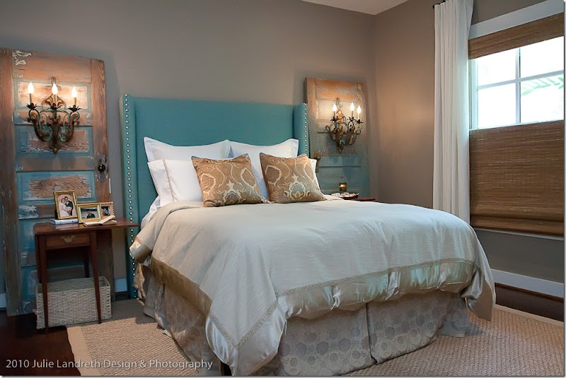
Lyndon West had just completed the guest room when I had been in the house and this was my favorite room - I loved the doors! These were found at an antique mart and the colors of the room were taken from the turquoise blue found in the doors. I love the mounted sconces. So clever! The headboard was custom made for the spot and the proportions are perfect, which is why one hires an interior designer!
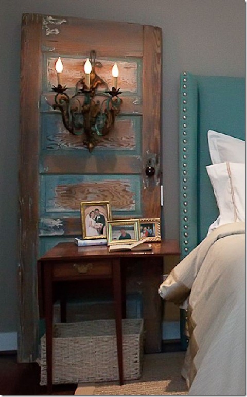
Here is a close up of the vintage doors with the mounted sconces. The old drop leaf tables are the perfect choice – a nice contrast between smooth and rough.
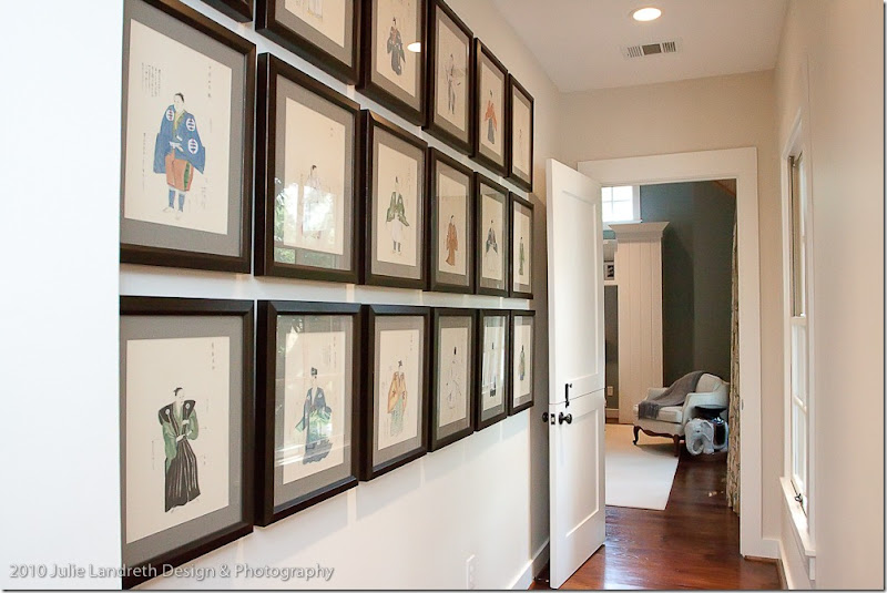
Leading into the master suite is a series of oriental watercolors – all framed alike. Framing anything alike makes so much more of a statement.
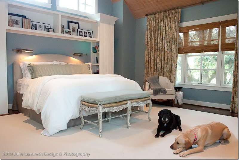
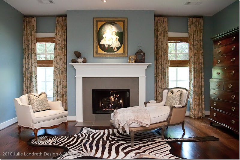
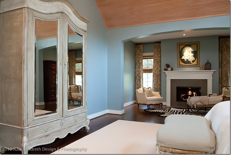
The master bedroom is large and includes a fireplace and a seating area. The bed fits into the niche between the bookcases. Do you remember when I discussed my love of the Robert Allen fabric Eleria HERE? Well, this is where I first saw the fabric! The homeowner has it in the other colorway, Biscotti. The Biscotti has a lot of deep aqua in it – the exact color of the walls here, plus there are touches of orange that run throughout it. I just ordered 80 yards of the Eleria in the Green Tea colorway for a client’s curtains. I only pray they turn out as pretty as these did. Cute dogs!
On the other side of the bedroom is the sitting area – with a great French chaise, half burlap-y, and half linen. More Eleria curtains. Notice the beautiful highboy behind the chaise.
And across from the bed is this large French armoire, painted.
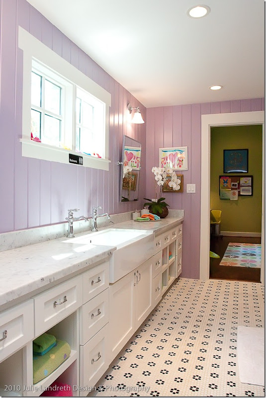
Here’s a peek at the daughters bathroom – all in purple paneling, with white marble and tiny black and white tiled floor.
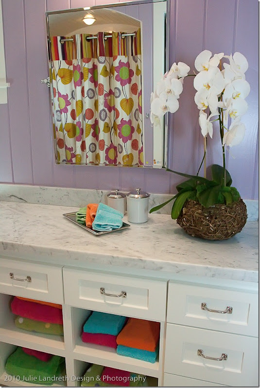
The curtain shower and towels were coordinated in bright colors. So cute. I wish there were pictures of the kids bedrooms – there is a loft area above the rooms. Oh well – maybe next time.
A HUGE thank you to the homeowners for sharing their beautiful house and a thank you to the designers from Lyndon West and the photographer Julie Landreth for sharing these pictures. I hope you enjoyed the tour!!
WAIT - There is More News:
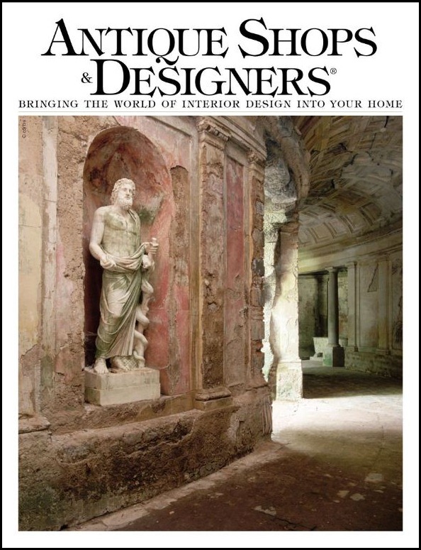
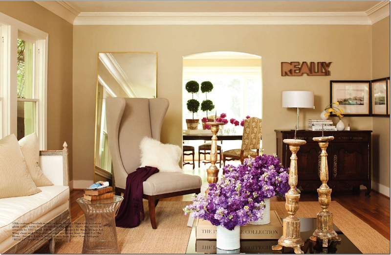
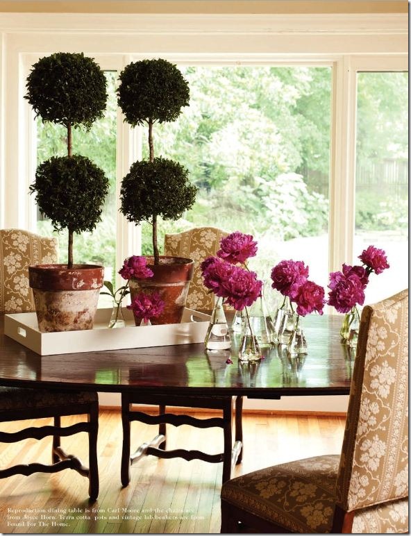
I recently told you about one article I wrote, Updating Your Décor, for the new issue of Antique Shops and Designers HERE, but I also wrote another article about the house owned by Ruth Davis of Found for the Home fame. HERE. The house is an original in the classy Old Braeswood neighborhood, dating back to the 1930s. Davis and her business partner/interior designer Aaron Rambo have filled the house with a mix of Swedish and French antiques along with contemporary art work and iconic furniture pieces.
Ruth Davis’ living room – filled with antiques and contemporary furniture and artwork.
In the article, Ruth confesses she is thinking about moving on, so it wasn’t a complete surprise when last night I got an email from Houston real estate superstar Cathy Blum. Cathy informed me that the Old Braeswood house is now up for sale! Just thought I would pass this info along to anyone who read the story and might be interested in buying it.
Davis’ dining room overlooking the back yard has a large French table surrounded by antique French chairs.
If you are interested in touring the house with Cathy Blum, this is the link to the listing with all her information on it: HERE.
AND, finally, one more piece of business for Skirted Roundtable listeners:
Blogger Meg Fairfax Fielding on the Nate Berkus show. Nah – we’re not jealous, NOT at all!!! ahahah!!!!!
We have a new Skirted Roundtable up! It’s an interview with Pigtown Design’s Meg Fairfax Fielding. Meg, who has written her blog for almost 4 years now, recently found a new vocation. Nate Berkus, former Oprah interior designer, discovered Meg and he recently had her on his show – twice, with more appearances scheduled in the future. Calling her The Junk Whisperer, Nate talks to Meg about her flea market finds, like the $2. Hermes scarves. Yes. It’s not everyday that a blogger ends up on national TV, so we just HAD to find out how she did it!!! Tune in to listen to one of Baltimore’s most famous daughters – Meg! HERE.
BTW, this past Monday, we had interior designer David Easton on the Skirted Roundtable. Let me be so bold as to say – it was really, really interesting! He is such a character – warm, friendly, charming, and funny. We had a great time. The Easton interview should be up next week. And that’s all, finally!!!



![meg_&_nate[2] meg_&_nate[2]](http://lh6.ggpht.com/_t8-Y4w1UKrc/TMElR245ptI/AAAAAAAA62o/CXC0GMWMknE/meg_%26_nate%5B2%5D_thumb%5B1%5D.jpg?imgmax=800)
